

This is the second in a series of articles critiquing the murals at Binghamton University. Read the first one here.
Both murals reviewed in our second installation of this series had a lot of potential, but one simply fell short of its ambitions, while the other turned out to be an utter disaster. For the rest of the semester, we’ll continue to trek the Unions, Old and New, to give each work of art an accurate assessment.
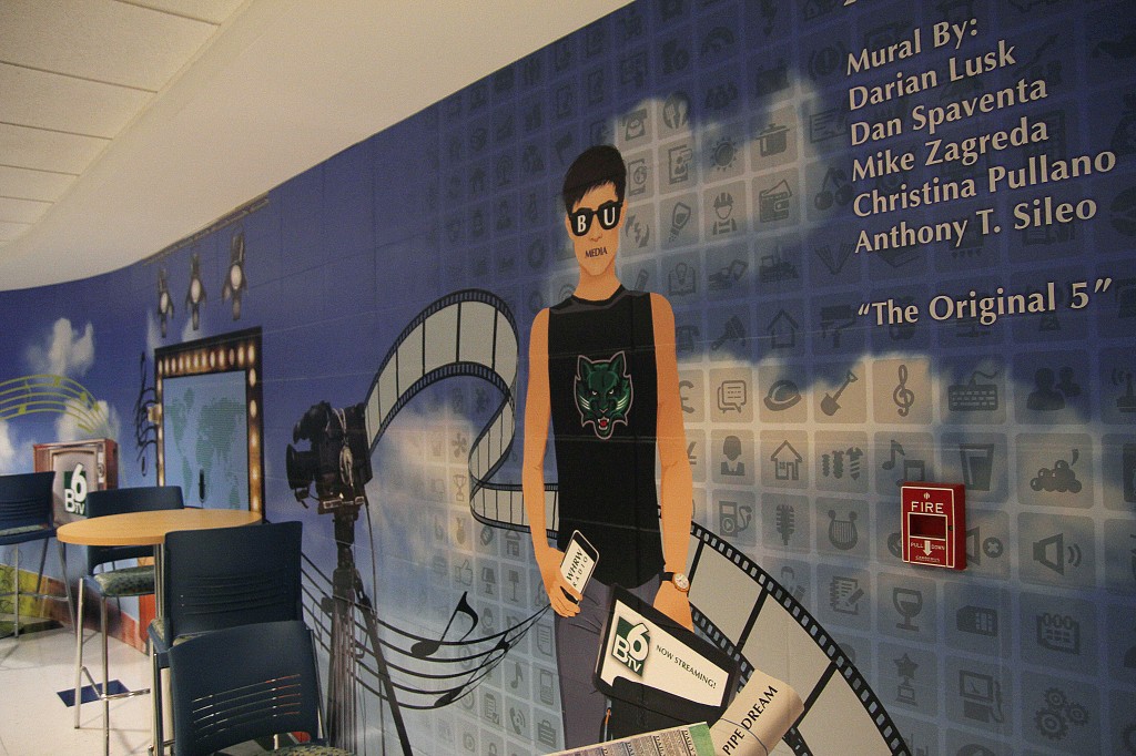
Campus Media
At the foot of the stairs from the Marketplace sits an utter catastrophe of art, a disgusting mishmash of awful clashing styles ostensibly meant to honor Pipe Dream, WHRW 90.5 FM and BTV. It failed at execution. It is not an honor, but a shame. The mural is split into three parts, incoherent both together and independently. On the left is Pipe Dream’s section, with WHRW in the center and BTV on the right. Each section has one domineering hyperrealistic element. Pipe Dream’s is a giant quill, and Pipe Dream’s printing press, according to the mural, doesn’t actually print Pipe Dream. The sheets of paper it prints read “The Colonial News” and “Daily News” (Pipe has never been daily). It makes no sense. The image flows left-to-right with a printing press, and then a radio and other audio-associated imagery, followed by a bunch of television and video-associated imagery. It would be fun to pick apart the elements of the mural and explain why each part is incoherent, but there’s nothing that even resembles coherence to pick apart.
On the far right of the mural, all the imagery and, weirdly, a sky, pulls back to reveal a background of … clip art. If you look closely at them, they’re random and completely absurd. Among the hundreds, there are: a lemon slice struggling to fit into a glass, a rotary phone dial, a bunch of gears, a tractor, a lightbulb laid on top of a book, a phone with “24” printed next to it, a petri dish, a splat, a cruise ship, a corkscrew, the scales of justice, a traffic light and the Beats by Dre logo. Really.
There’s one human on the mural, who would be described as bro-y if he had enough detail to properly describe. All the imagery on the mural seems to feed into him. He is the ultimate media student. He has a boner, partially hidden by a tablet that says “BTV6.” But for some reason, there’s a censor bar on his mouth with the word “media” on it, as if the media is censoring him. Students of Binghamton University, we strive to be your voice. Please ignore the mural.
Hillel Lounge
Alright Hillel, we get it. We really do. Harmony. Peace. This land is my land, your land, Binghamton, Israel. We know. And I guess that’s just the problem: We’ve seen it before. Not with Binghamton, per se, but the melding of skylines isn’t really an original concept. The mural had a lot of potential, and it wasn’t quite achieved. For those who haven’t seen this one, there’s a silhouette of the ocean, which slowly blends into a silhouette of the Jerusalem skyline, which slowly blends into a silhouette of the Binghamton skyline, which slowly blends into a silhouette of mountains. We’re not quite sure what the mountains are supposed to be, but if they’re supposed to be America, the mural seems to be saying that Binghamton can bridge the gap between Israel and the United States. That’s a nice sentiment, but we’ll say that the gap exists within the Atlantic Ocean, and growing strains between Obama and Netanyahu.
To its credit, insofar as the mural aims for its goals, it achieves them. The navy and blended sunset hues are beautiful. But the mural just doesn’t give the meaning the wall deserves. We want to see blended cultures, not just blended colors.