

This is the first in a series of articles critiquing the murals at Binghamton University. Read the second one here.
One of the traditions of campus art is painting murals: for a student group, for a cause or just for decoration. And, as pieces of art, each mural deserves to be criticized. Here are our thoughts on some of the paintings in the University Union.
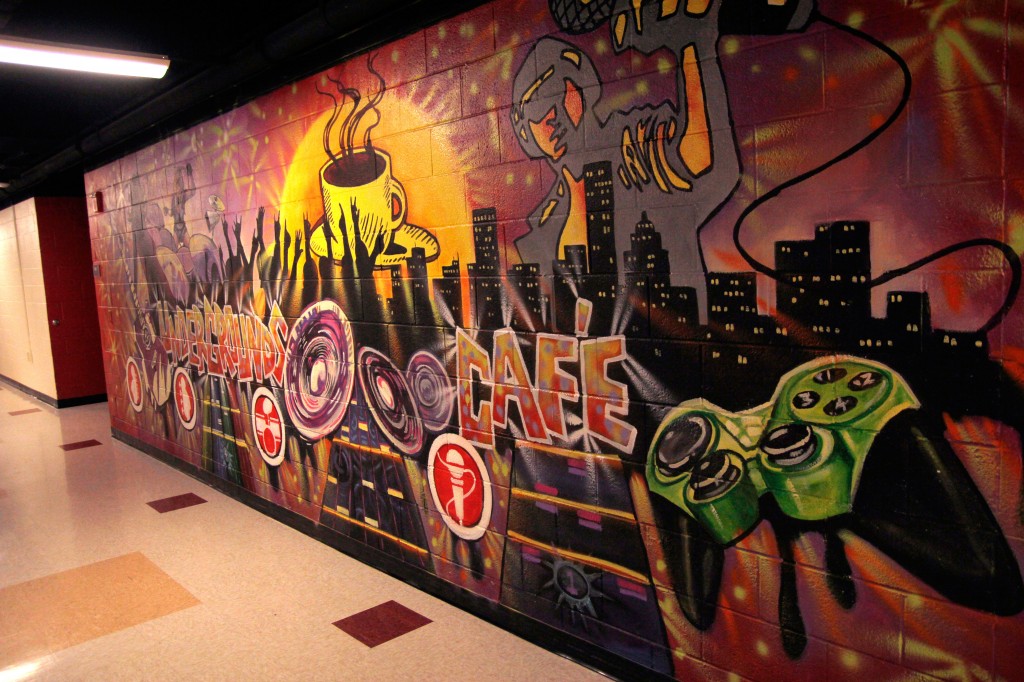
The Undergrounds Café
Outside of the Undergrounds Coffeehouse, there is a mural that pays tribute to the three C’s: color, coffee and confusion. In what looks like the ’90s vomited every watercolor palette it shouldn’t have swallowed, a mishmash of silhouettes are worshipping a cup of coffee at a rock concert. Really. It’s as if the artist was desperately trying to be hip in 2006 and failed at even that, making the mural seem even more dated. It’s a pathetic attempt to capture a concert scene that might happen on TeenNick, but not in real life, and definitely not in the Undergrounds. The band members are strewn across the painting in different artistic styles.
The bottom of the mural is a bizarre tribute to X-Box, with a green controller on the right and guitar hero on the left, twice. The entire thing is off balance, as if the artist started a pattern and then forgot to finish it. And the cymbals! Are they supposed to be cymbals? There’s just a pile of them facing in random directions in the center of the painting. It makes no sense.
“From Breadth Through Depth to Perspective”
Since painting this mural in 2011, former BU student Kady Perry has done a lot for Binghamton’s artistic community, working in several excellent art education programs and other efforts to beautify Binghamton. One of her first big hits was the mural in the New Union basement, with the University’s slogan on it. It’s great to bring color down here, but upon closer inspection, it’s had a good run. It’s now time for a new coat.
If you were wondering what part of campus you can find depicted here, then good question, because we were wondering too. We see a bad dream version of the Nature Preserve, where the sky is white and the clouds are blue. Additionally, if the dining halls ever ran out of cookies, not to fear. Legend has it that the Keebler elves live in the bottom left corner. Go look for it. At the right, there are signs directing the viewer to different offices in the basement — even BTV, which isn’t a real organization — but not the Pipe Dream office. And yet somehow there’s enough room for a muffin and an empty cup sitting on it. The environment is also unsettling. What are these mountains? The Himalayas? The benches are surrounded by weeds and bees. But, like we said, Kady Perry is now doing great things — this was just her jumping off point.
Food Co-Op
There’s a nice mural of New York state and the Nature Preserve lake at the back of the Food Co-Op, but the real beauties are the tables. Each one has its own beautiful color palette — some bold, some subtle and dreamy. They all use, of course, nature themes: plants, water, celestial figures. Most murals are forced into a rectangular shape, but the tables take advantage of the circular frame, being somewhat symmetrical and pattern-based. There’s one of an elephant and a giraffe on a rectangular table that isn’t very good, though.
Rainbow Pride Union
RPU’s mural, at first glance, seems completely chaotic, an assault on the senses. But upon closer inspection, it’s one of the most beautiful in the Union. Though it’s on a wall, it doesn’t restrict itself to a square shape, instead using jagged edges and a careful blend of bold colors. The remaining portions of the wall are devoted to a blackboard for practical use. The mural itself depicts several colorful gender-ambiguous figures helping each other out of water — it’s so much more subtle than an obvious painting of harmony between people of different sexual orientations. We’re not sure what’s up with the orb, though, but we hope to find out one day.